Form UI Design | 22 Tips
Form UI design is one of the essential skills in any designer’s arsenal. Forms are the basis of countless different kinds of apps and tools. An effective form can be the difference between a profitable app project and one with poor usability, retention, and engagement.
It’s easy to assume that forms are straightforward interfaces, but the reality is that even subtle changes can have a huge impact.
Today, we’re going to look at 21 actionable tips for creating better forms. Specifically, we’ll look at the design, UX, technical, and aesthetic factors that determine the success of your form’s UX.
First, though, let’s think about why this matters.
What impact does form UX have?
To understand this, it’s worth thinking about the different roles forms can play. At a basic level, forms can be used for three broad categories of actions:
- Creating database entries.
- Updating existing entries.
- Filtering or manipulating displayed data.
In practice though, each of these actions can be used in a variety of contexts, to facilitate countless different user actions.
Depending on the context, an improved form UI can mean better conversion rates, higher task completions, faster internal workflows, more accurate data entry, improved information sharing, happier customers, and reduced administrative burdens.
As such, the effectiveness of your form UIs is directly tied to your application’s profitability, in almost any use case.
Check out our ultimate guide to app UI design .
Measuring ROI for web forms
Of course, it’s vital that you can properly measure the impact of any changes you make to your forms, or even of entirely new interfaces.
For this to work, we need to have a concrete goal in mind.
This should be something quantifiable. For instance, a certain percentage increase in the conversions on our lead forms, or a measurable reduction in the admin work required to complete an internal task.
We can then compare the effectiveness of your UIs with your previous processes, and translate the resulting change into financial terms to figure out the return on investment.
What makes an effective form UI?
So what are the characteristics of a profitable form UI? There are a few key factors at play here.
Here are the key factors that you need to pay attention to.
Accuracy
Accuracy is how easily your users can provide the correct information within forms. This determines the quality of the data you gather.
There are two levels to this:
- Users’ ability to determine what information they’re supposed to provide.
- The format and content of this information.
Both of these are critical for ensuring that you gather usable data.
For example, even in totally qualitative data sets, the format of information is crucial, whether you want it to be usable by human readers or parsable by automated processes.
Efficiency
Efficiency is probably the most important measure of a form UI’s success. This is how quickly users can take action, and how few steps they need to go through to do so.
This determines two things:
- How much work your internal team can get through during repetitive tasks.
- How willing external users will be to complete the tasks you want them to.
So, this can either determine the labor costs required by a given process, or the conversion rates of your customer-facing tools.
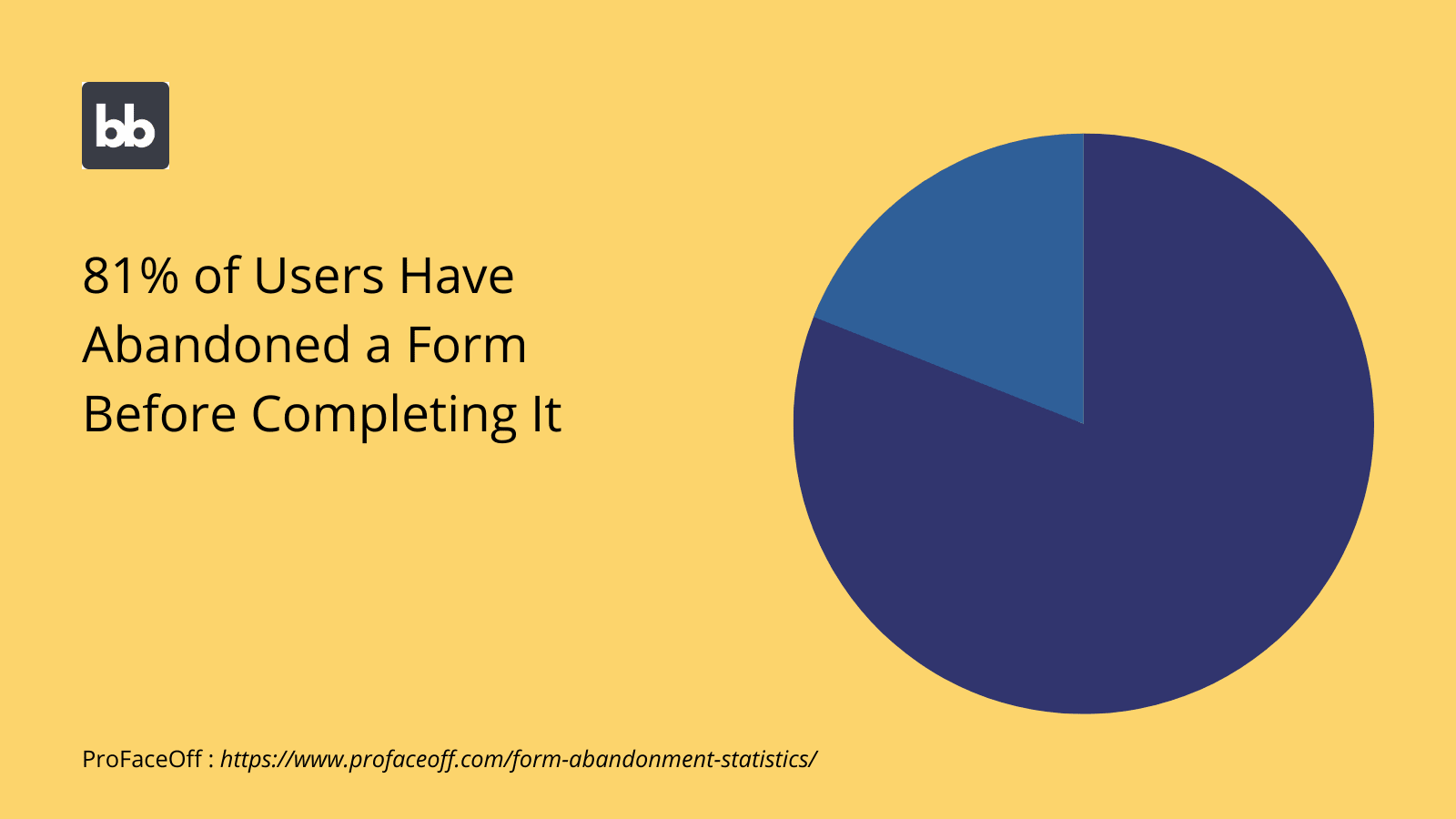
For example, say you had 10,0000 users landing on your lead generation form each month. The trouble is, filling in the form is a long, slow process, so about 5% of these people give up halfway through.
If you cut this drop-off rate to 1% using a more efficient form UI, you’d have an extra 400 leads per month, without needing to spend any more money on acquisition.
Security
Believe it or not, your apps’ form UIs also play a role in their overall security. Remember, forms aren’t just used to create new database entries. They can also filter or update existing ones.
As such, you might want to limit certain classes of users’ ability to interact with and manipulate sensitive attributes.
Of course, forms are used in a couple of other more security-specific contexts. For example, creating passwords or consenting to different kinds of data processing.
As such, the interfaces you build for these functions are a core part of your information security strategy.
Usability
Usability refers to how intuitive people find your interfaces. Naturally, this cross-cuts with efficiency and accuracy. However, it can also influence completion rates in its own right.
Of course, forms are pretty simple by their nature. Still, there are a few areas where things can go wrong.
For example, if users don’t know how to save their form responses or if they can’t tell whether they have saved them successfully.
Performance also plays a role in usability. For instance, if a form component is unresponsive, it will prevent users from taking their desired actions, creating a poor UX.
21 form UI design tips you can use today
Now that we know what a great form looks like, we can think about some of the actionable strategies you can use to provide incredible experiences.
From simple design improvements to more sophisticated techniques, we’ve compiled our list to turn your forms into conversion machines.
Here we go.
1. Keep it simple
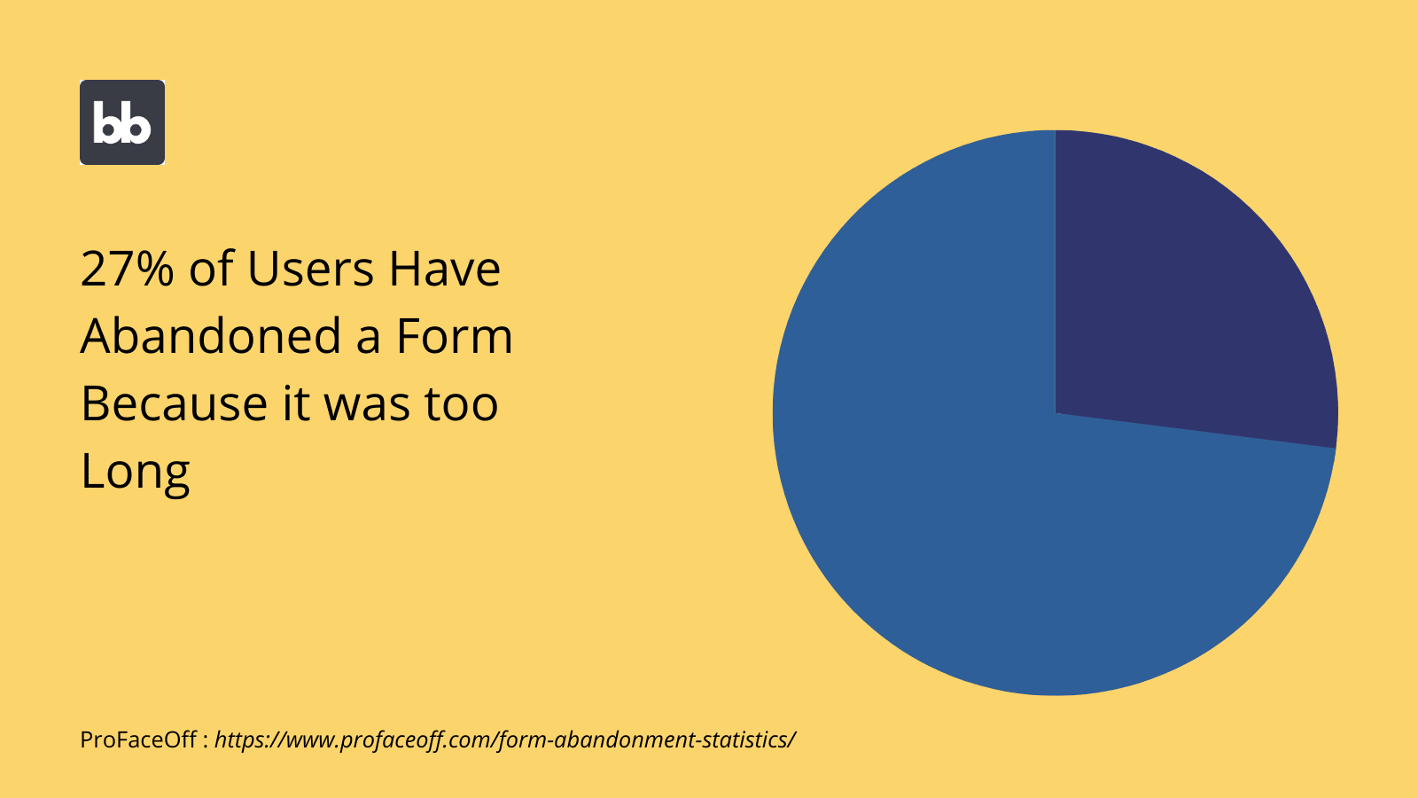
Simplicity is key. In many contexts, there’s a direct link between the number of fields you include in your form and how likely users are to complete it. That is, for public forms, the less information users have to give, the more likely they are to give it.
Of course, there’s a bit of a balancing act here. That is, there’s also a relationship between the amount of information users provide and how useful these responses are to you.
Long before the design stage, you can begin planning for this.
This means thoroughly prioritizing the attributes you want to collect, as well as thinking about other strategies you can use to streamline your UXs, to make users more amenable to providing more in-depth information.
2. Use clear labels
Labeling plays a huge role in your forms’ intuitiveness, usability, and efficiency. Labels are the names that you display to users for different attributes within your form UIs.
Of course, there are some situations where this comes into play more than others.
For example, some form fields, like the user’s personal information, are pretty self-explanatory. Others, like open-ended questions, have more scope for confusion or ambiguity.
The key here is to ensure that all fields are labeled with simple, non-technical language. Depending on your target userbase, you might frame this in terms of complete questions, rather than simply using field names.
For more complex use-cases, you might also choose to provide extra rubric on different fields, using text boxes, or even modal pop-ups.
3. Start with the easiest attributes
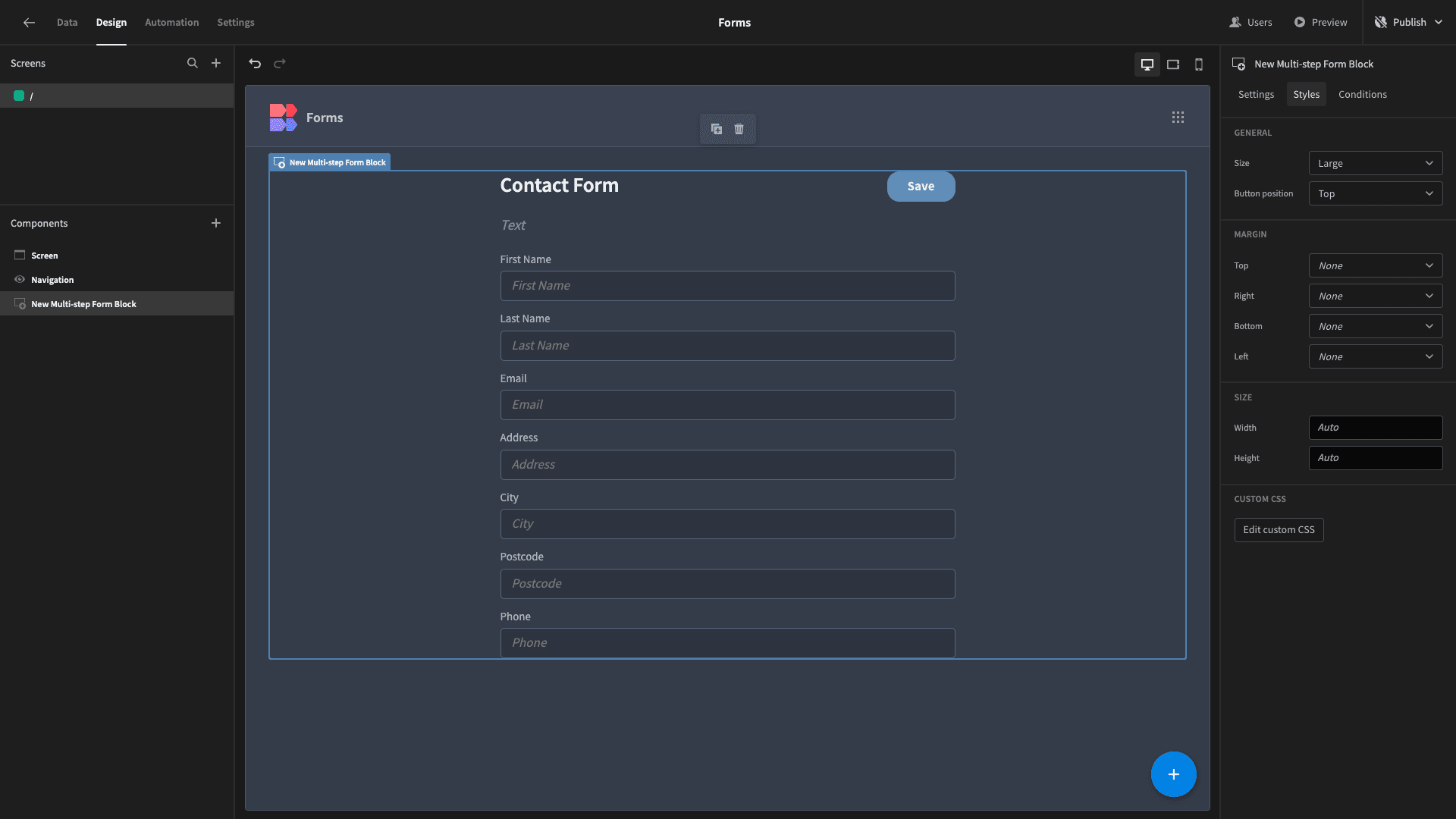
This one is more experience-focused. The idea here is to ease users in, by placing the short, easy form fields at the beginning. Longer or more open-ended attributes can be collected later.
Users will be more willing to carry on and complete more complex forms when they feel like they’ve already invested time and effort in the simpler ones. The more progress users feel like they’ve already made, the more willing they are to continue.
Most often, this means displaying basic fields, like personal information first.
This trick works equally well in surveys, sign-up forms, and internal tools. This can also be complemented by a range of other techniques, as we’ll see.
4. Autofill and smart defaults
Auto filling data is one of the most important steps you can take toward building more efficient forms. Obviously, when users don’t need to enter specific values, this creates a much more streamlined user experience.
Default values can be populated from a range of different sources, including user information, system data, or previous actions.
The idea is to create rules to autofill form fields, based on the values that users are most likely to provide, while still giving them the ability to override these.
For example, by using users’ stored phone numbers by default in a call-back form, but still allowing them to provide a different number by editing this.
5. Columns and horizontal layouts
There are a few different approaches to laying out individual fields within a form UI design. You’ll often see one cited as better than another, but the reality is that they’re best suited to different contexts.
For example, many people will advise you that it’s best to restrict your form to a single-column layout, for all fields.
This is an easy way to create a minimalist, decluttered interface. However, it also has the drawback of using up a lot of vertical space, especially in longer forms. This can seem overwhelming to users.
One alternative is to use multiple columns, at least for some fields.
For instance, in a payment authorization form, you might use sub-columns to display fields for expiry dates and CVV2 codes on a single line.
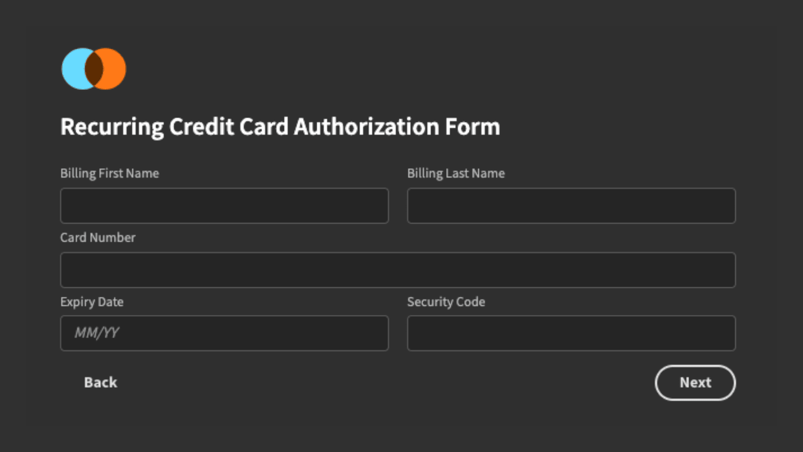
This is an effective way to minimize vertical space. It also allows us to more neatly tailor the width of individual form fields to the character count of the data we expect users to provide.
6. Use multi-step forms
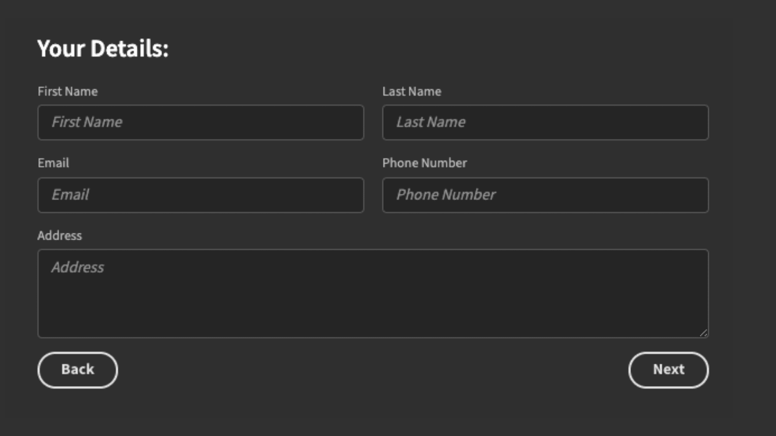
Alternatively, you can break long forms into multiple discrete steps. Generally, this means grouping related fields and attributes together, so that users only need to deal with one cluster of information at a time.
So for example, in a check-out form, you might use four distinct steps for:
- Personal information.
- Users’ addresses.
- Payment details.
- Final confirmation.
We’d use next and back buttons to navigate between form steps, before displaying a more prominent CTA to confirm the order on the final step.
When you opt for multi-step forms, it’s also worth displaying users’ progress to them. For example, we could use a progress bar or a simple text field to show how many stages they’ve completed and how many they have left to go.
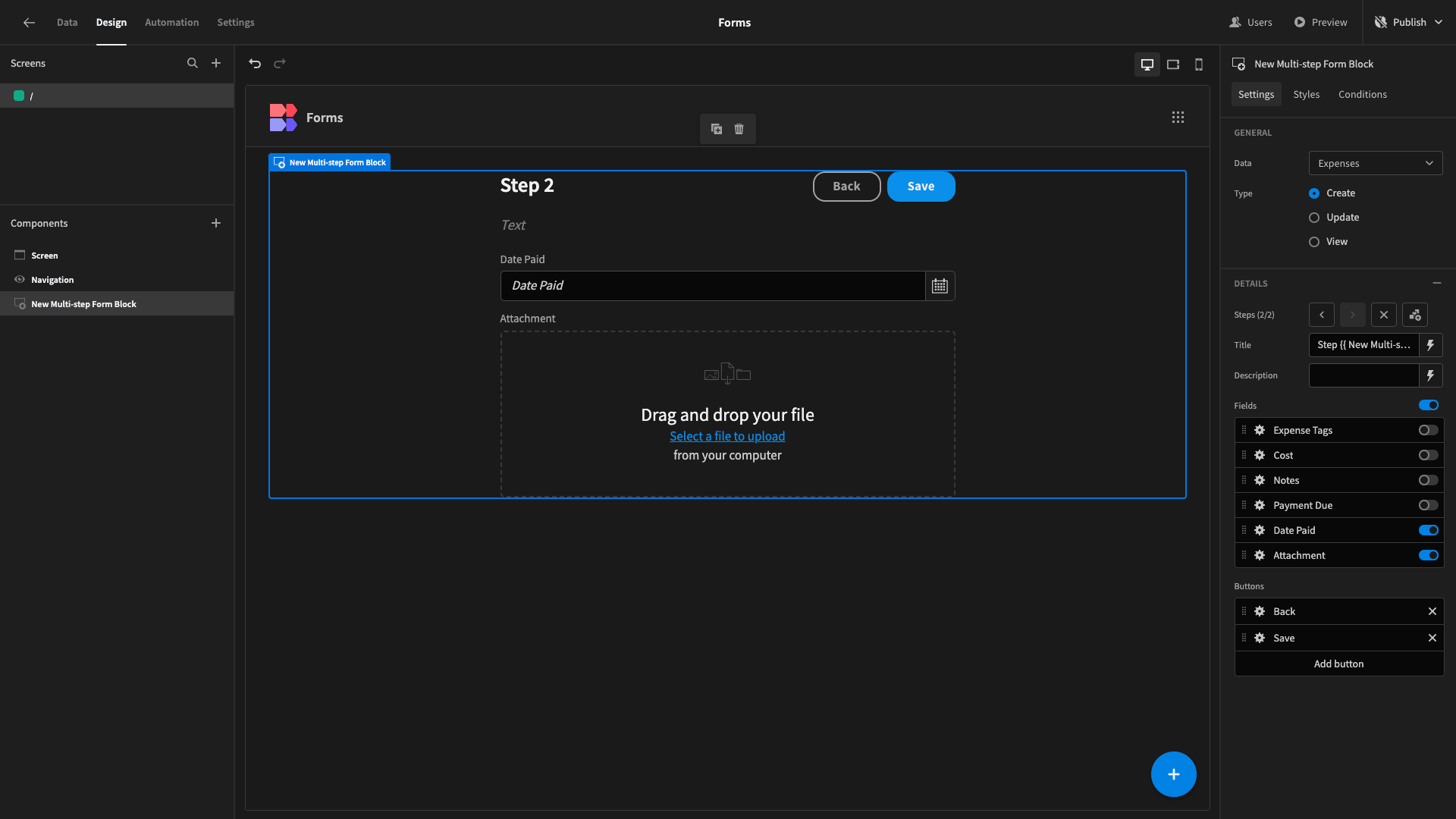
With Budibase, it’s never been easier to create multi-step form UIs. Our multi-step form block inherits the schema of supported data sources. All you need to do is arrange your fields and form steps - and apply any styling you want.
Use our multi-step form blocks to create, update, or view records in internal tables and SQL databases.
7. Conditional form UIs
Conditionality means creating rules to display, hide, or update different components, based on set criteria. This could mean leveraging user information, back-end data, environmental factors, or in-app behavior.
This has countless uses when designing form UXs.
One way to leverage conditionality is by using user attributes to alter UIs. For example, you might provide additional form fields for users who have a higher access role.
Alternatively, you could use users’ current devices to display entirely different versions of your UIs. So, you might create multi-step forms for mobile users, but use a single screen for desktop devices.
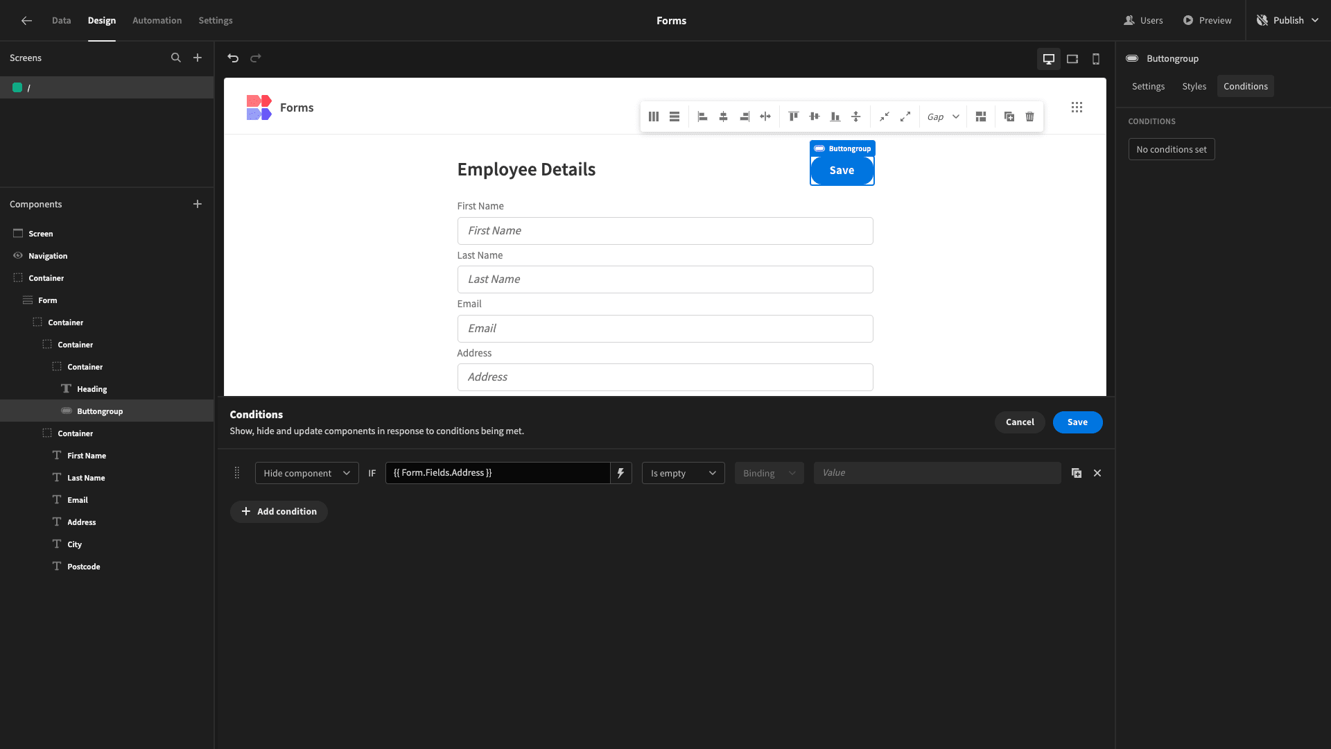
Budibase leads the form builders market for flexible, advanced conditional UIs. Every Budibase UI component offers a dedicated conditionality editor.
You can use our dropdown editors - along with handlebars expressions and custom JavaScript to build bespoke rules - for any of the component’s configuration options.
8. Know your users
Thorough user research also helps you to develop the optimal UIs for their needs. This includes factors like their digital literacy, familiarity with the topic of the form, accessibility needs, device preferences, and ultimate goals.
This can inform everything from your choice of language to the specific components, layouts, explanatory copy, and other design elements that you include in your form interfaces.
For example, if you wanted to create a form within a public-facing web app , where users can submit information requests, you’d need to do more to guide them through the process than you would in a similar internal tool.
Similarly, we could approach our form layouts or even the actual components we use for each field, based on our target users’ technical knowledge.
Say you had a device rental form for IT assets. We’d probably expect users to provide more in-depth information about the assets they need within a software development company than we would within a law firm.
9. Approaches to mobile forms
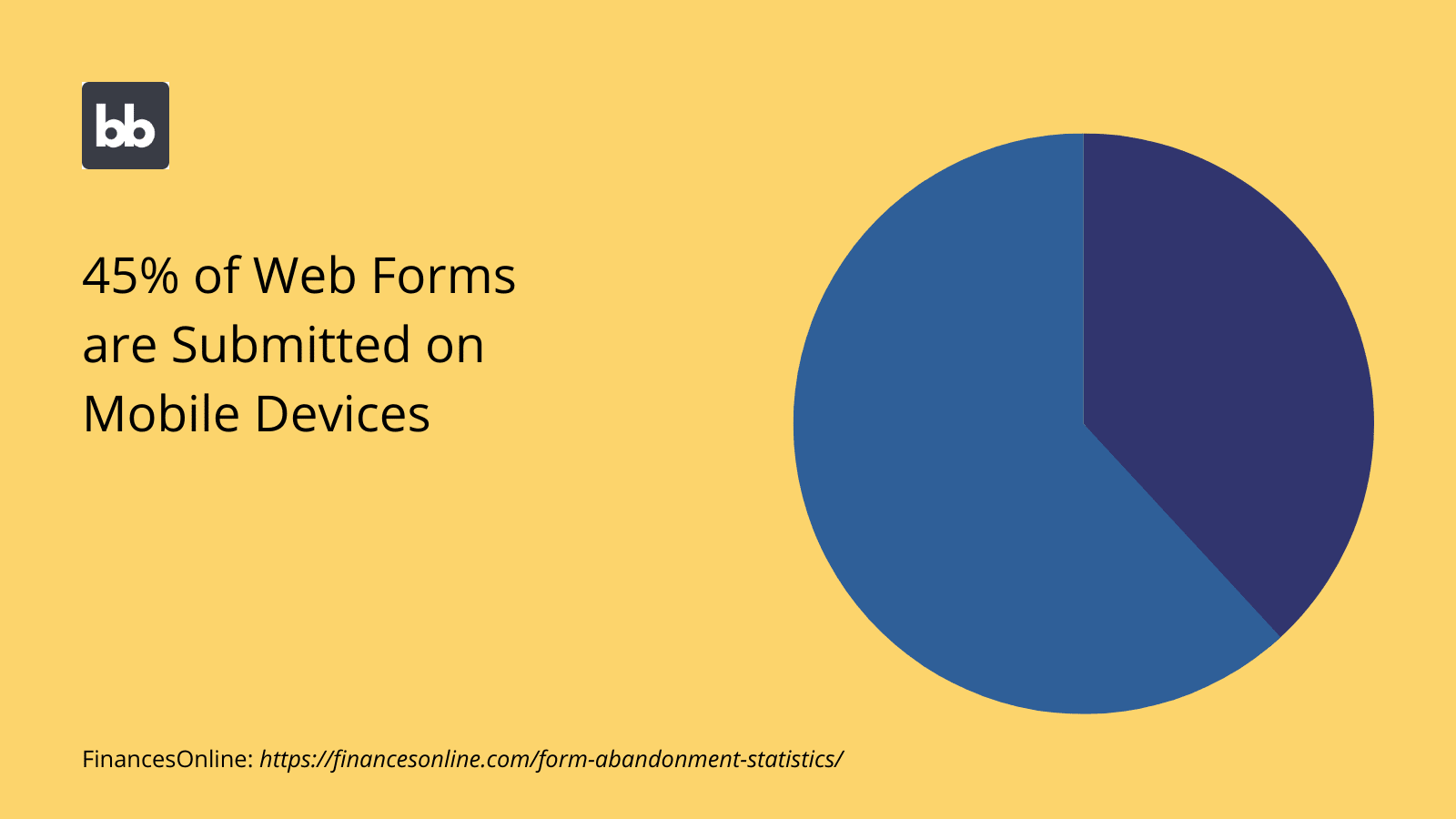
We’ve hinted at this already, but there are a few different ways that we can tackle form UI design for mobile users. Earlier, we looked at how you can use conditional designs to display different interfaces to users based on their device type.
This isn’t your only option though.
You can also create a single interface for all kinds of devices, and use responsive designs to make it appear correctly on different sizes of screens.
Responsive design means that on-screen elements automatically scale and resize, based on the device they’re viewed on.
Of course, you can also use both of these strategies in tandem. Budibase offers custom conditionality rules and fully mobile responsive components across all of your tools.
10. Divide fields into semantic groups
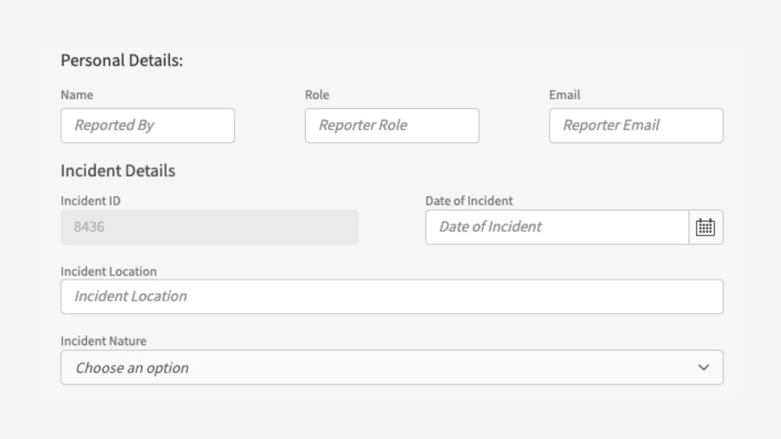
One of the most important steps you can take when designing a form UI is to properly cluster your fields into related groups. This helps to provide a sense of structure and allows users to focus on what topic or idea at a time.
The goal here is to minimize the cognitive burden on users.
That is, we can only hold so much information in our heads at once. Providing a clear, organized structure to your forms allows you to keep users engaged, while also encouraging them to provide the exact information you require.
Let’s think about how this might work in a complex form UI, like an IT incident report. We’d need to collect several different kinds of information, including on:
- The nature of the device.
- The nature of the incident
- Any impact it had.
- What follow-up actions were taken.
- What additional actions need to be taken.
The extra challenge here is extracting detailed information from users who might not be technical experts.
Clustering these topics helps to provide clarity to users, meaning that they can provide the right information under exactly the right fields.
11. Leverage visual constraints
There are also several ways we can use visual constraints to help provide a smooth form UX. Recall that some of the characteristics of an effective form are efficiency and accuracy. That is, empowering users to input the right data, in the least amount of time possible.
One trick we can use here is to adjust the width of different form fields, based on the expected format and length of the values users will provide.
This achieves two things:
- Subtly encouraging users to provide data in the correct format.
- Decluttering your UI by freeing up more screen space.
This is most often used where input values have a fixed length. This includes things like phone numbers, dates, credit card numbers, ZIP codes, and more.
For certain kinds of data, we can take a similar approach with the height attribute of different fields. Say we had a form with multiple open-ended questions, but we wanted users to provide more detail under some than others.
We could use long-form text components for all of these kinds of questions, but use a larger height attribute for those questions where detailed responses are a higher priority. This is an effective visual cue that users should provide more comprehensive information.
12. Outline optional and mandatory fields
It’s normal for forms to have a mixture of mandatory and optional fields. However, it can create real user experience problems when these aren’t properly stipulated in your interfaces.
For example, if users assume that all fields are mandatory, they might give up when they encounter data they can’t provide, even though this is supposed to be optional.
On the flip side, if users assume that mandatory fields are optional and then receive an error message when they try and save their response, they might leave your form entirely, rather than going back and correcting it.
We can use several different techniques to signpost mandatory or optional fields, including asterisks, additional textual elements, or differentiating with color-coding.
13. Display formatting rules in placeholders
Another easy way to improve accuracy and efficiency in your forms is to clearly communicate the correct format for different attributes in your placeholder texts. These are the strings that appear in form fields before users have provided values.
You’ll often see this trick employed for things like dates or credit card numbers, where there are several different formatting conventions out there.
So, if we wanted to ensure that users provide their date of birth in American shorthand format, we’d set the placeholder text for this component to MM/DD/YY.
This is most useful in cases where data is a string with numerical characters.
14. Consider the users’ role
It’s also vital to build your UIs around your existing role-based access control system, or whichever other method you use to grant or limit permissions.
One of the core principles of good UI design is to display the minimum number of elements that allow users to carry out their desired functions. We should apply this logic within each individual role in our apps.
For example, you might have navigational elements in your forms that allow users to access additional features. If a certain user role can’t access this feature, they shouldn’t see these elements.
Similarly, you might want to provide additional attributes within a form for users with higher levels of permissions. For example, if you have a workflow, where users from different roles can add new information at each stage. For example, within an incident investigation.
We could provide a better user experience and more expedient workflow by allowing users from higher roles to add all of their available attributes when they create a new entry.
You might also like our guide to table UI design .
15. Alignment
The alignment of different elements can greatly impact the effectiveness of different form UIs. Even subtle differences in alignment can quickly ruin user experiences. Take customer-facing tools for example.
Misaligned elements project a negative image of your brand, making your tools appear cheap and unprofessional.
Poor alignment can also create problems for users accessing your forms from different kinds of devices. This is obviously problematic for public and internal apps alike.
As such, it’s vital that all form fields and components are consistently and neatly aligned.
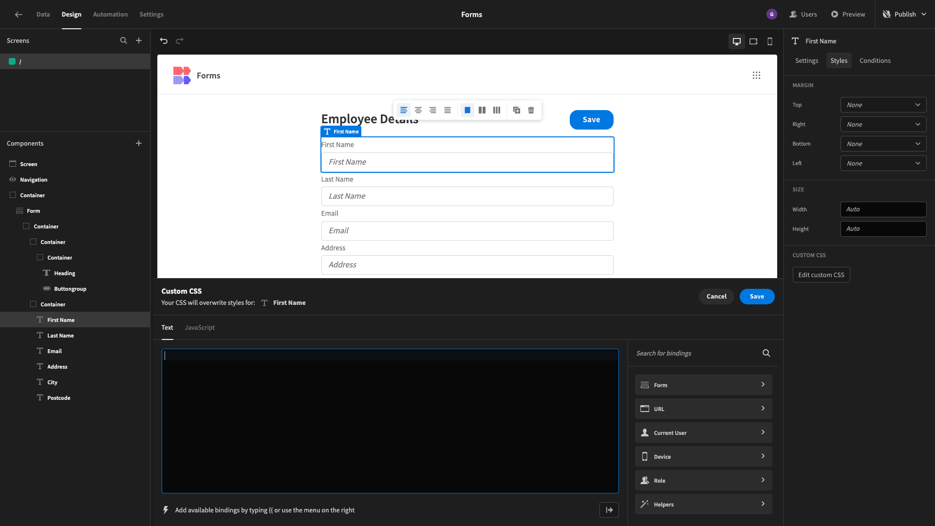
Budibase is the clear choice for design customization. We offer huge scope for styling, arranging, and aligning UI elements with minimal custom code. Or, you can add your own CSS on a per-component basis, for near-endless customization.
16. Use appropriate CTAs
Your choice of calls-to-action greatly impacts the usability of your forms. This is particularly important in conversion-focused apps, like sign-up tools or other sales and marketing interfaces.
There are two levels to this:
- Making it clear to users how they can take different actions.
- Encouraging more users to take your desired action.
There are essentially five variables that make up the design of your CTAs and action buttons:
- Size.
- Shape.
- Positioning.
- Color.
- Copy.
Our goal is to create engaging CTAs that are appropriate for the specific use case of your form.
Generally, we want to use high-contrast colors and action-related words to ensure that our CTAs are as clear and compelling as possible.
17. Backward navigation
Backward navigation is an often overlooked aspect of form UI design. That is, users’ ability to go back from any screen to where they were previously in the app.
With specific regard to forms, there are two varieties of backward navigation:
- Allowing users to move backward through multi-step forms.
- Allowing users to quickly navigate to whatever screen originally led to the form.
On the first point, we simply need to add button components on all but the first step of the form. For the second, we can use breadcrumbs to provide a clear trail of all of the parent and child pages users went through to access our form.
18. Choose components wisely
One of the core parts of creating and optimizing form UIs is selecting components that closely match your data model . In some cases, like simple strings or numerical data, the right choice is fairly self-evident.
In other cases, you’ll want need to consider how you can provide the easiest user experience for your target audience, for each different value you want to collect.
For example, you have a few different options for recording dates. On many web forms, you’ll see options pickers or individual number fields for days, months, and years.
Alternatively, Budibase offers a dedicated date picker component, that allows users to quickly select specific days and times using an intuitive calendar interface.
19. Validation options
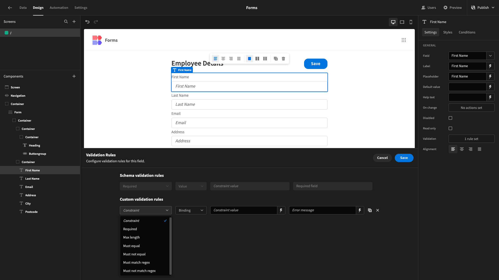
Validation rules are essential for maintaining the accuracy and integrity of your form responses. These can apply to both formatting and actual values. For our purposes today, we’re simply concerned with how we treat these validation rules within our interfaces.
We have a couple of different options here, including:
- Inline validations - error messages are displayed beside individual fields when a value is entered that doesn’t meet your validation rules.
- Save validations - error messages are displayed when users submit their form response.
- Step-based validations - for example applying rules at the end of each form step, and displaying error messages before users proceed.
Each of these has its own benefits and drawbacks. For example, applying validation rules when the user hits the save button is the easiest method to implement. However, it has the obvious drawback that users need to complete the form before validating individual fields.
By contrast, inline validation is more complex to implement but provides real-time feedback as users work through your forms.
Budibase provides extensive flexibility for adding custom validation rules to forms. Again, we can add custom rules to any form component, using a combination of drop-downs, handlebars expressions, and JavaScript.
20. Dropdowns vs radio buttons
In many situations, we’ll want to present our users with a variety of set options for enumerator attributes.
We have a couple of different options for how to do this.
- Radio buttons.
- Drop-down selectors.
There’s no right or wrong answer here. However, there are a couple of specific things you can pay attention to, to decide which is right for your application.
One is the number of options you want to offer. Radio buttons are the faster way for users to view and select from different options. They’re also better for visualizing linear relationships between options, like in a five-point Likert scale.
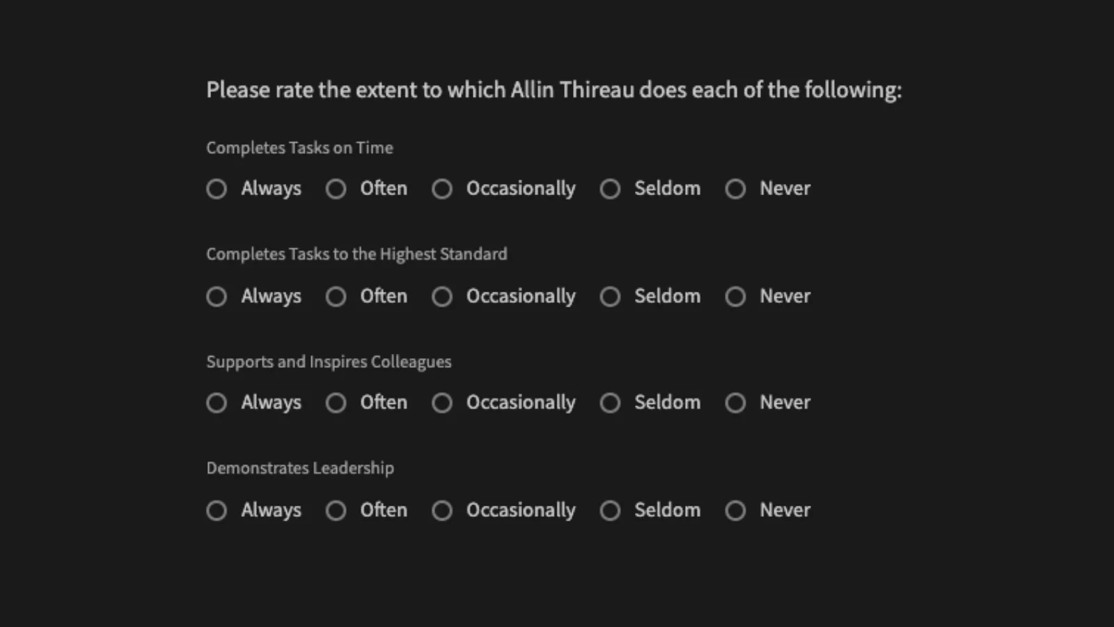
The trouble is, they can look unappealing or even overwhelming with more than a handful of options.
They also take up a lot of space.
As such, drop-down selectors are often the better option when you have a relatively large number of options, even though they require more clicks from users to take action.
Check out our guide to enterprise app UI design .
21. Personalization
Finally, we have personalization for form UIs. Of course, this requires you to already have some stored data on your users. The goal is to use this to create more bespoke, engaging forms, leading to better user experiences.
You can leverage personalization to different extents.
This could be as simple as displaying users’ names in your titles. You could also opt for a more in-depth strategy. For example, by using users’ previous responses to modify your messaging around future form fields.
You could even display entirely different form fields based on user responses at each step, to create branching logic within surveys.
22. Low-code form UI design
We can also think about how we design and output forms at a broader level. Forms are some of the most common UIs around. So, it makes sense to think about how we can build them at scale - as well as how we design individual interfaces.
Most teams rely on one of two approaches to form UI design:
- Dedicated form builders - like Google Forms or JotForm.
- Front-end frameworks - like Angular or React.
The trouble is that traditional form builders lack advanced capabilities. The likes of React and Angular require comparatively high technical skills - without eliminating the need for full-on development tasks - and the associated time and cost.
Low-code development bridges this gap. Budibase offers intuitive visual experiences for building forms that don’t compromise on advanced functionality or customization. There’s never been an easier way to build professional, advanced forms.
Connect to any data, build bespoke form UIs, automate processes, and deploy your custom to the cloud or your own infrastructure with our open-source, low-code platform.
Low-code form UI design from Budibase
Form UIs are the core of all kinds of applications, from simple single-function tools to complex customer-facing portals. Understanding how to create an effective form UX is one of the essential skills of any designer.
Budibase offers a suite of tools to help you build better forms, in less time than ever before.
With autogenerated CRUD screens, custom conditionality rules, configurable RBAC, optional self-hosting, on-click automations, and more, our low-code platform is the fast, easy way to build professional forms.
Check out our extensive range of form templates to see more of what Budibase can do.